Xcode Previews are great. To be able to immediately see how changes in your code are rendered immensely speeds up the development process and makes developing UI elements real fun.
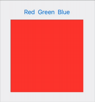
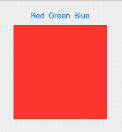
What makes previews even better is that they automatically become interactive when your View has a @State. Consider this code:
struct ColorSwitcher: View {
    @State var color: Color

    var body: some View {
        VStack {
            HStack {
                Button("Red") { color = .red }
                Button("Green") { color = .green }
                Button("Blue") { color = .blue }
            }
            color.frame(width: 200, height: 200)
        }
    }
}

#Preview {
    ColorSwitcher(color: .red)
}
With automatically gives you a preview that is interactive. When you click on the buttons you can see that the colors change:
So far, so easy.
Things become a bit more complicated when your view uses a @Binding instead of a @State. This is really common when you implement custom UI controls:
struct ColorSwitcher: View {
    @Binding var color: Color

    var body: some View {
        VStack {
            HStack {
                Button("Red") { color = .red }
                Button("Green") { color = .green }
                Button("Blue") { color = .blue }
            }
            color.frame(width: 200, height: 200)
        }
    }
}

#Preview {
    ColorSwitcher(color: .constant(.red))
}
Now you need to instantiate a Binding inside the #Preview. The only way to do this without having access to a @State is to use a constant binding. This works but now the interactivity is gone. You can still tap the buttons, but the colors do not change (because the binding is a constant binding that cannot change).
Previously (before iOS17) you help yourself by adding a preview wrapper that can have a @State:
struct ColorSwitcherPreviewWrapper: View {
    @State var color: Color = .red
    var body: some View {
        ColorSwitcher(color: $color)
    }
}

#Preview {
    ColorSwitcherPreviewWrapper()
}
This works, but it not a very elegant solution.
iOS17 to the rescue!
Now we can use the new @Previewable tag to allow a dynamic property to appear inline in a preview.
#Preview {
    @Previewable @State var color = Color.red
    ColorSwitcher(color: $color)
}
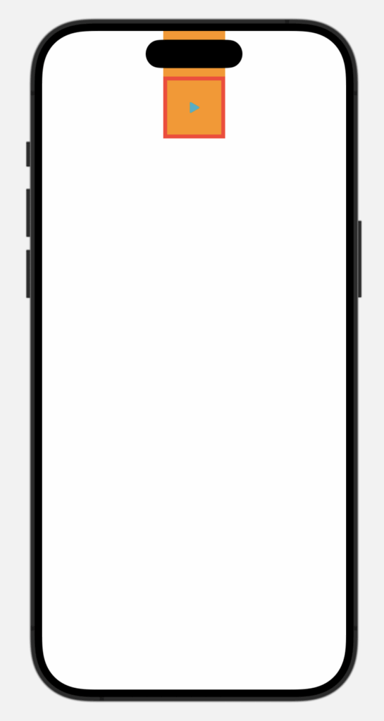
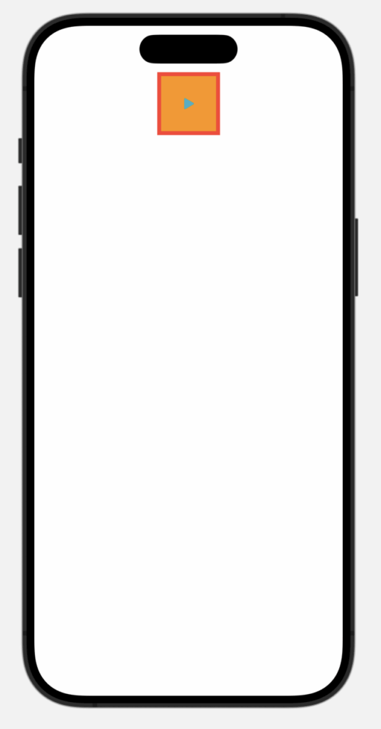
Recently I was confronted with a strange behaviour of a Button in SwiftUI. The button was placed directly at the top of a view that was at the border to the top of the screen near the status bar. Somehow the button’s background color was stretched all the way to the top. In other words: the buttons background color was underneath the status bar, but the button was not.
As you can see, the background color is stretched to the top under the status bar and magic island. Strangely the border is not.
There are use cases where this behaviour is wanted (like extending the background color of a view into the safe area). But for this button it is definitely not wanted. The fix to this is really easy. The .background modifier has a second parameter ignoresSafeAreaEdges that takes a Edge.Set value. The default value for this parameter is .all which extends the background into all safe areas. If you pass an empty Set you can stop the bleeding 😉
You have to draw an arc or a semicircle in SwiftUI. The most obvious way to do that is to use a Path. In this blog post you can see how to do that, but it is really not rocket science.
Turns out there is an even quicker and easier way to draw a fraction of a circle. SwiftUI’s Shapes have a method called trim(from:to:) that allows you the specify what fraction of a Shape’s path you want to draw. If you want to draw a semi circle you could call that method like this:
As you can see the path of a Circle shape starts at the right center (or 03:00 hours on a clock). Because the value that you pass as from parameter has to be smaller than the value for the to parameter, you cannot draw a semicircle from top to bottom like this because that would mean that you would have to set from to 0.75 and to to 0.25. That is not allowed.
With a little trick you can still achieve that. You simply draw a semicircle from 0.0 to 0.5 and then rotate the shape by -90 degrees. IMHO still simpler that using a Path for this.
You can use this trim method on all SwiftUI’s built-in Shapes. For example if you want to draw a right triangle with SwiftUI you can do this:
Rectangle()
    .trim(from: 0.0, to: 0.5)
    .fill(Color("pdMagenta"))
    .frame(width: 120, height: 80)
Of course you could easily draw a Path for this, but I think the trim method is a pretty cool tool that you can use for drawing semicircles, quarter-circles or triangles.
Now we need to let SwiftUI know what kind of arc we want to draw. As a human I would describe the arc as starting at 90 degrees and ending at 180 degrees, because we are usually assuming that 0 degrees is at the top of a circle.
SwiftUI begs to differ. In SwiftUI 0 degrees means straight to the right. In other words:
Human 90 degrees == SwiftUI 0 degrees
Because of that we need to draw and arc from 0 degrees to 90 degrees. (I add a gray background, so we can see the frame of the arc)
Seems pretty straightforward, but the result is a not what I would expect:
This is where things get wild. According to Apple’s docs SwiftUI (and UIKit) use a flipped coordinate system.
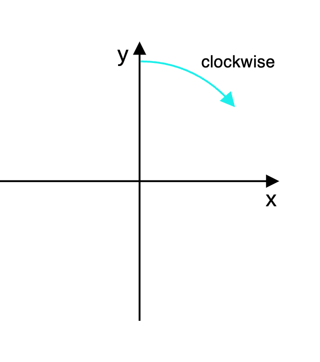
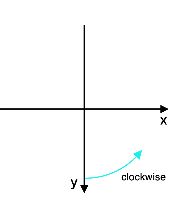
To explain what that means let’s have look at these two illustrations:
In a Cartesian coordinate system (that we humans are used to) increasing values on the Y-axis go up to the top. Resulting in the “clockwise” that we are used to.
In SwiftUI’s flipped coordinate system increasing values on the Y-axis are going down to the bottom of the canvas. And that results in a reversed “clockwise” direction. IMHO that is really counterintuitive, but that’s the way it is 🤷♂️ This is an excerpt from the Apple docs: “In a flipped coordinate system … specifying a clockwise arc results in a counterclockwise arc”
In other words: Clocks run backwards in a SwiftUI context.
To get the arc we want we have to toggle the clockwise parameter in our custom ArcShape: